
Work
NBC.com
Web Experince


Overview
NBC.com aimed to enhance its digital presence by delivering a seamless, engaging web experience for its diverse audience. This project focused on modernizing the design to align with NBC's brand identity while addressing usability challenges across its content library. By prioritizing both aesthetics and functionality, we sought to create a platform that delighted users and supported NBC's business goals.
Project Duration
March – May 2014
Product Statement
The revamped NBC.com is a dynamic platform designed to bring viewers closer to their favorite shows and live TV content. It combines intuitive navigation, robust search capabilities, and an engaging interface to ensure users can effortlessly discover, stream, and interact with NBC’s rich entertainment offerings.
Goal
Our primary objective was to create a responsive, user-friendly web experience that balanced NBC’s iconic branding with modern usability standards. We aimed to improve user engagement, simplify content discovery, and ensure the platform worked seamlessly across devices, driving both viewership and user satisfaction.
My Role: Visual UI/Product Designer
As the UI/Visual Designer, I was responsible for crafting a cohesive visual language that adhered to NBC's brand guidelines. I designed interactive components, established scalable design patterns, and collaborated with cross-functional teams to ensure the final product resonated with users and aligned with the project’s goals. My role also involved creating detailed visual assets to guide the development process, ensuring pixel-perfect execution across all touchpoints.
Design Process
Research and Discovery
Due to the urgency of putting out the new and updated web product, we set up week-long sprints to expedite the discovery process. Grouped together in brainstorm sessions the product design team came up with the following design principles for the new NBC web experience:
1
Clear: Simplify the interface to clarify relevance.
2
Direct: Communicate with purpose and tell meaningful stories.
3
Impactful: Ensure every element contributes value.
4
Emotional: Build a narrative that resonates with the audience.
5
Engaging: Foster experiences that encourage users to return.
6
Holistic: Design with a responsive approach for all platforms and devices.
Data analytics drove requirements which called for a new site structure with streamlined user experience optimized for 1280 desktop viewpoint, with larger images and simplified interface.


Ideation
Wireframes and Flows
The wireframes established intuitive user flows to simplify navigation and ensure essential NBC content was easily accessible and engaging. These flows streamlined the user experience, aligning with clear design principles.
In the visual design phase, bold imagery and dynamic elements were introduced to create an eye-catching, engaging interface that captured the essence of NBC’s brand identity.
User Flow
Site navigation was restructured to prioritize video consumption—the platform's core offering. Unscripted shows received dedicated contestant landing and detail pages to enhance discoverability.

Low-Fidelity Wireframes
Collaborating closely with the UX team, I helped create detailed wireframes with layout specifications and annotations for typography, iconography, and site behaviors. These provided developers with clear, actionable guidelines.

Visual Design
It was time to define the site’s visual language, text styles, and patterns. During early explorations, we raised key questions: Should this feature stand out with a distinct background color and texture? What illustration, iconography and text styles best align with the brand? These considerations guided the development of a cohesive and engaging design system.
Iconography
Intuitive, simplified icons replaced the cluttered visual elements of the previous design. This approach ensured users could navigate the platform quickly and confidently, even in complex environments.
Typography and Font Mapping
After testing multiple fonts, we selected two open-source Google fonts and a system font, mapping them to designs with appropriate tags for developers, ensuring a consistent typographic hierarchy.


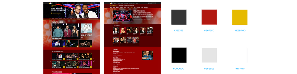
Color Palette, Mapping & Background Textures
The color palette consisted of a primary and highlight color, supplemented by neutral tones. These were derived from show artwork and tagged for easy integration into the CMS. Subtle evergreen textures addressed branding requirements for show backgrounds while maintaining visual harmony.


1
Clear: Simplify the interface to clarify relevance.
2
Direct: Communicate with purpose and tell meaningful stories.
3
Impactful: Ensure every element contributes value.
4
Emotional: Build a narrative that resonates with the audience.
5
Engaging: Foster experiences that encourage users to return.
6
Holistic: Design with a responsive approach for all platforms and devices.
Data analytics drove requirements which called for a new site structure with streamlined user experience optimized for 1280 desktop viewpoint, with larger images and simplified interface.
Typography and Font Mapping
After testing multiple fonts, we selected two open-source Google fonts and a system font, mapping them to designs with appropriate tags for developers, ensuring a consistent typographic hierarchy.
Visual Design
It was time to define the site’s visual language, text styles, and patterns. During early explorations, we raised key questions: Should this feature stand out with a distinct background color and texture? What illustration, iconography and text styles best align with the brand? These considerations guided the development of a cohesive and engaging design system.
Iconography
Intuitive, simplified icons replaced the cluttered visual elements of the previous design. This approach ensured users could navigate the platform quickly and confidently, even in complex environments.
Low-Fidelity Wireframes
Collaborating closely with the UX team, I helped create detailed wireframes with layout specifications and annotations for typography, iconography, and site behaviors. These provided developers with clear, actionable guidelines.
User Flow
Site navigation was restructured to prioritize video consumption—the platform's core offering. Unscripted shows received dedicated contestant landing and detail pages to enhance discoverability.
Ideation
Wireframes and Flows
The wireframes established intuitive user flows to simplify navigation and ensure essential NBC content was easily accessible and engaging. These flows streamlined the user experience, aligning with clear design principles.
In the visual design phase, bold imagery and dynamic elements were introduced to create an eye-catching, engaging interface that captured the essence of NBC’s brand identity.
Design Process
Research and Discovery
Due to the urgency of putting out the new and updated web product, we set up week-long sprints to expedite the discovery process. Grouped together in brainstorm sessions the product design team came up with the following design principles for the new NBC web experience:
Color Palette, Mapping & Background Textures
The color palette consisted of a primary and highlight color, supplemented by neutral tones. These were derived from show artwork and tagged for easy integration into the CMS. Subtle evergreen textures addressed branding requirements for show backgrounds while maintaining visual harmony.
The Final Product
The redesigned NBC.com launched in Fall 2013, delivering a cleaner, more user-centric experience. It marked a significant leap forward, setting a foundation for subsequent updates and ongoing improvements. Being part of this transformation was a rewarding experience that showcased the power of collaboration and thoughtful design.
Takeaways
Impact
The redesigned NBC.com web experience drove significant growth, achieving a 22% increase in video consumption within the first month of launch. Unique visitors aged 18 to 34 surged to 15.2 million, compared to 12.8 million the previous month. Additionally, NBC.com’s global ranking improved, rising from 4,643 to 6,201 over three months.
What I Learned
Challenges: Designing a clean, user-centric interface that prioritized video content and boosted viewership.
Key Takeaways: When time is critical, seamless collaboration between teams is essential to deliver impactful results.